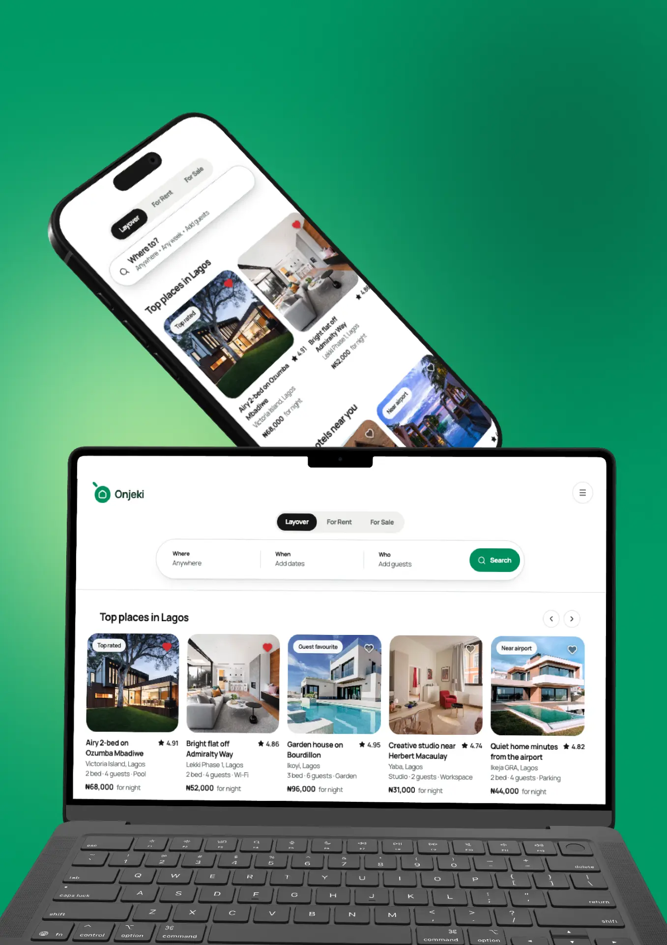
Onjeki
A curated home destination that blends renting and owning into one calm, considered journey.
Overview
Most property platforms force a choice at the front door: are you renting or are you buying? Onjeki's thesis was that people don't think that way. They think about where they want to live, and the tenure is a detail they settle later.
We designed a product around that. One search surface, one listing model, and a tenure filter that adjusts the numbers rather than sending you to a different site. The hard work was the financial clarity: monthly cost, deposit, and total commitment are presented side by side in the same visual language, whichever path you're on.
The identity is quiet on purpose. A soft, wide wordmark, a warm neutral field, and one indigo accent reserved for the moments that matter: saving a home, booking a viewing, signing. We shipped it as a documented design system so their in-house team could keep extending it without us.
Approach
Tenure as a filter, not a fork
Rent and own share one listing model. Switching tenure recalculates the numbers in place instead of restarting the search.
Financial clarity, one grammar
Monthly, upfront and total costs use identical typography and order everywhere they appear, so comparison takes no effort.
A system their team can run
Tokens, components and content rules documented end to end, the reason support load dropped after handover, not before.
Deliverables
Results
4.8★
App store rating at launch
−52%
Inbound support tickets
3×
Listing completion rate
Next project
Laura's Glam